Today I decided to pull out the Soft Pastels Assortment that I purchased months ago. I remember playing with oil pastels as a teenager and purchased them out of nostalgia. It’s been a long time since I used them though and once I took them out I found that I had no idea how to use them, lol. I started coloring with them on the image from the Better Places Hostess set, just as if they were crayons or colored pencils.

They are messier then colored pencils. After my first attempt (above) I decided to watch some YouTube videos and see what some artists had to say about using oil pastels. So, I went back and added more color to my image and blended them using an artists stub that I had in the very back shelf in my craft room. I was using a Q Tip before and it did work, but the stub was much better.
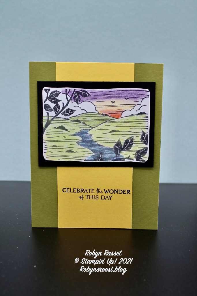
I did find that I was wishing there was a white color in the set, I think it would give a whole additional option of colors to blend. Here is my second version of the card using a bit different coloring scheme. The darker green was used on the grass and no red and yellow on the sky.
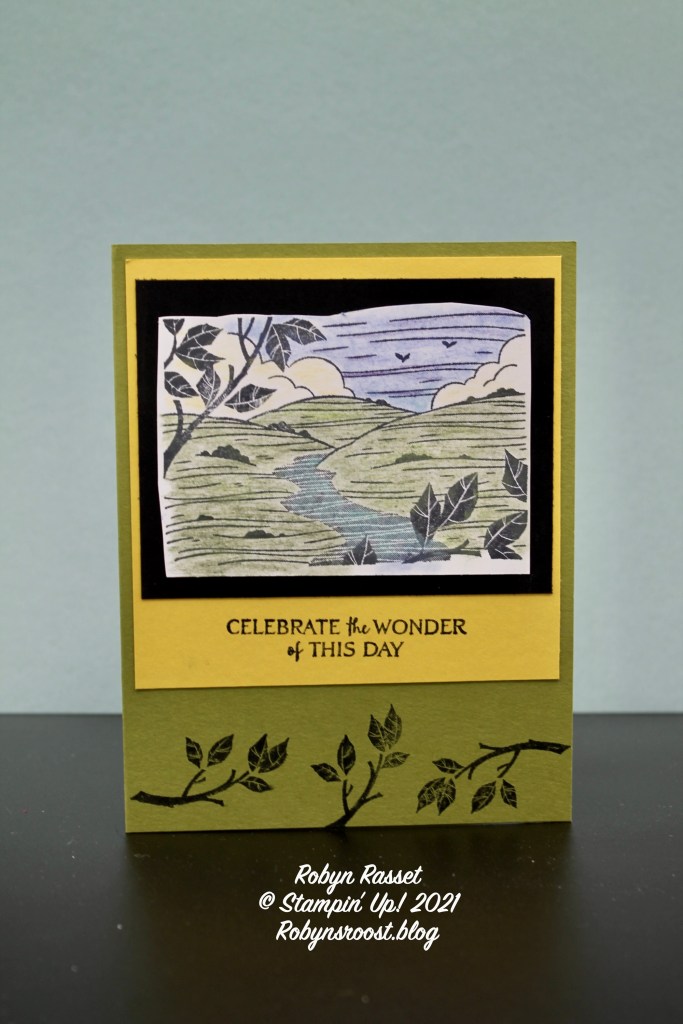
The Daffodil Delight layer on this card is a 4″ square instead of the 2 1/2″ x 5 1/2″ strip that was used on the first card. Both images were trimmed around with a scissors to give an uneven edge and layered onto a 3 3/4″ x 3″ piece of Basic Black.
I also did one of the images with Watercolor Pencils to see how much different it would look.

I do think that the Oil Pastels give a richer color but the Watercolor Pencils are less messy and faster. Having both just gives more coloring options.
Product List