
This pretty card is CASE’d (Copy And Share Everything) right from page 39 of the January to June Mini Catalog. Why reinvent the wheel, right? Take the gorgeous card layouts in the catalogs and recreate them either exactly as they are or put a unique twist on it to make it your own.

Here is my version of the card.

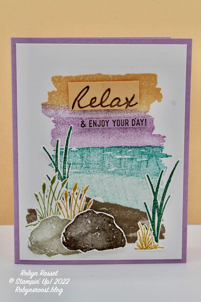
Here is the catalog version.
It’s pretty easy to see the similarities between the two cards. Mine uses some different colors and placement of the die cut elements. The biggest difference is the greeting label and stamp set used for the greeting.
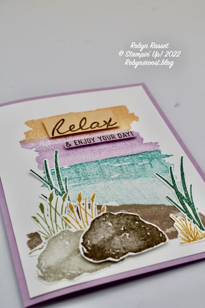
Both the sky and the water stamps are inked with 2 colors of ink, Pale Papaya and Fresh Freesia for the sky and Bermuda Bay and Pool Party for the water.
The greeting is stamped twice, once on Pale Papaya and again on Fresh Freesia papers. Then they are cut apart and layered onto the corresponding ink colors on the card, using dimensionals. Both greetings were stamped using Soft Suede ink. The rocks and sand are done with Crumb Cake, Sahara Sand and Soft Suede inks. The rocks and grasses are fussy cut with a scissors. The Oceanfront stamp set doesn’t have a matching die. Bummer, but it wasn’t too difficult to cut out these images. It also doesn’t have any greeting images so I chose one from the On the Horizon stamp set, which has a similar feel.
What colors would you choose to create this card? Which stamp set would you pick for a greeting?
Wow, I didn’t realize how many ink colors were used on this card until I created the supply list for you!
Product List

")


A great CASE Robyn. You are right, why reinvent the wheel 🙂
LikeLike